
What did I do there?
I was hired because of my experience building design systems so that’s where I started.
I also:
Created assets to improve employee onboarding (with little to no resources for me to understand procurement, I wanted to learn everything and create new assets so other employees could absorb domain knowledge faster). I created:
User Personas (different user types with different primary goals and motivations)
User Journey Map (a flow that a specific user persona goes through when interacting with Graphite)
Created marketing assets as needed
Coordinated with developers to move existing projects forward
Used the design system on other projects so I could continually refine it. “Ate my own dog food” so I could improve it.
Tools on the job:
Figma for all the component pieces
Figma for animation
Apple QuickTime for screen recording
A website called ezgif.com for turning those videos into bite size gifs
Slack for Team communication and alignment
Design System Breakdown:
I met with the development team and learned that they were importing the majority of their component pieces from a Vue Bootstrap library.
I set out to mimic that library so the design system would look very similar to that (which means a lot less css customization for the developers)
I built the following: (parenthesis is the number of variants) (471 variants)
Accordions (4)
Avatars, People (48: 12 color options and 4 size variants)
Avatars, Company (48: 12 color options and 4 variant sizes)
Alerts (10: 5 Colors and 2 sizes)
Badges: (48+)
Deletable Badges
Number Badges
Status Badges
Banners (10)
Buttons: (96+)
Large Buttons
Small Buttons
Icon Buttons
Cards (4)
Checkboxes (25)
Color Palette (lots of variants—each color could be considered one.. so I’m just going to say 1)
Combo-Boxes (9)
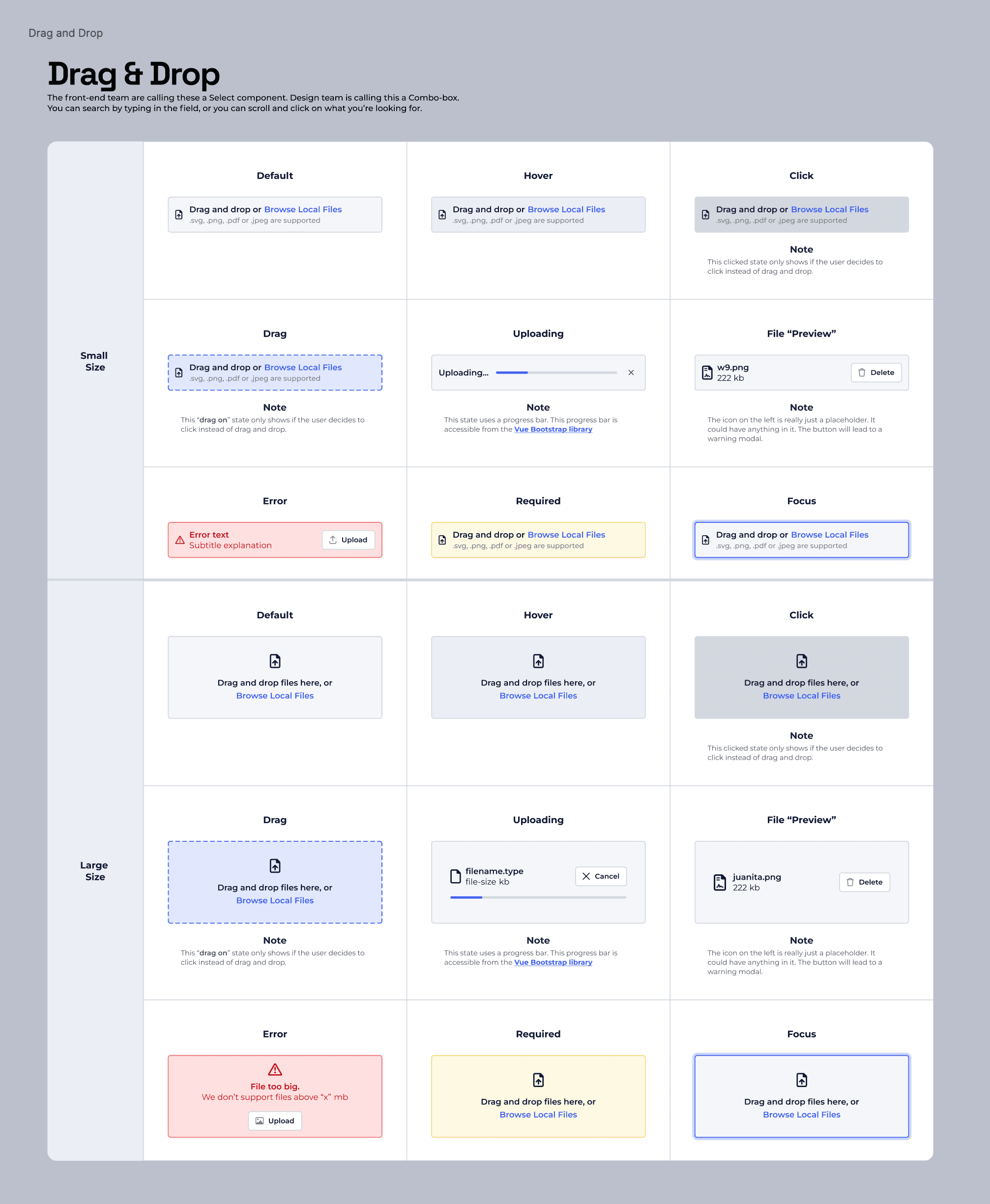
Drag and Drops (18)
Dropdown (6)
Dropdown Item (6)
Empty States (1)
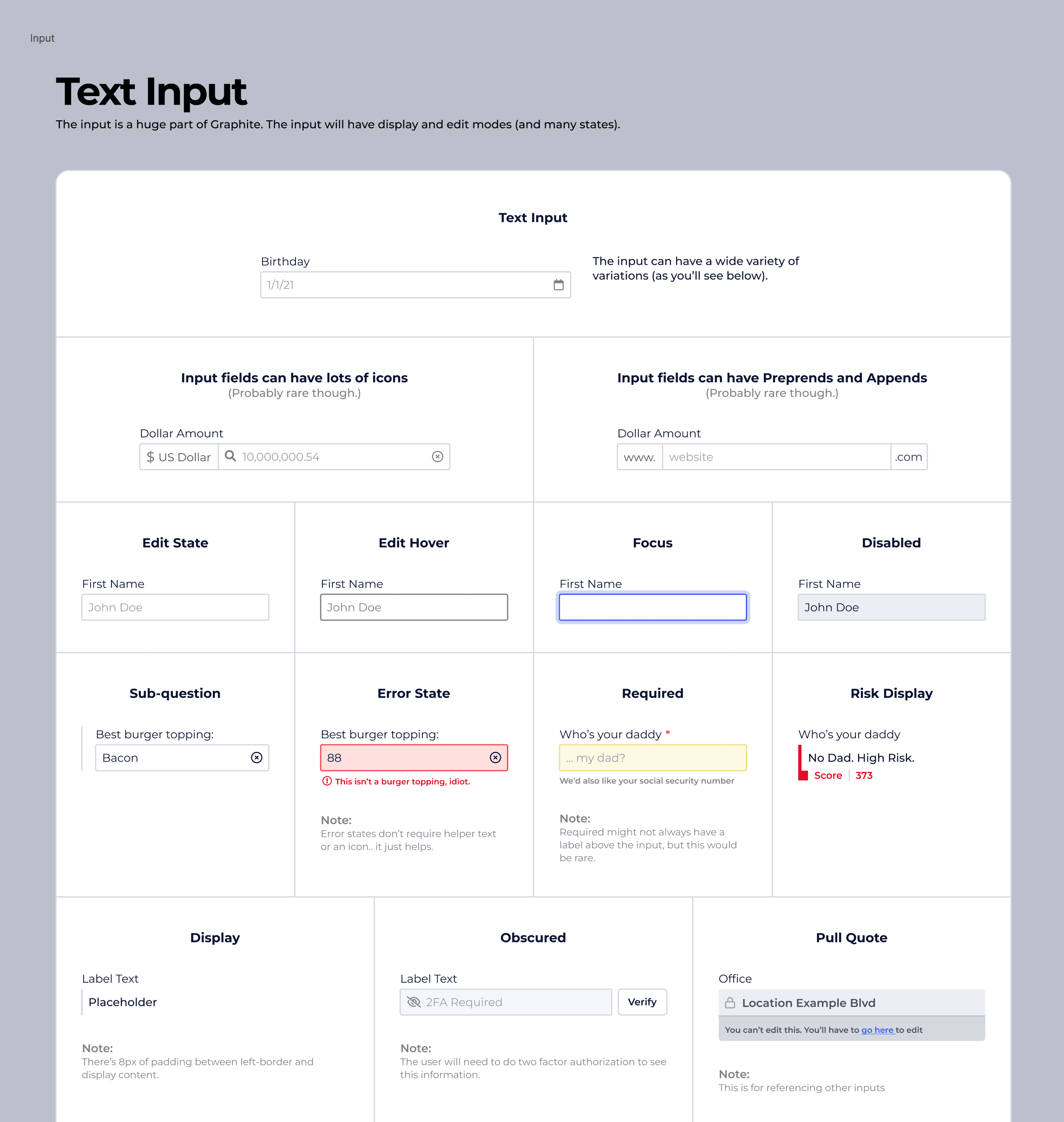
Inputs (32)
Links (4)
Menu Piece (4)
Menu Component (4)
Modals (2)
Navigation, Top (8)
Navigation, Item (8)
Navigation, Side (8)
Pagination (4)
Progress (5)
Radios (30)
Segmented Controls (4)
Table (12)
Table Cell
Table Header Cell
Toasts (10)
Tooltip (1)
Typography Styles (lots of variants—I’ll just say 1)
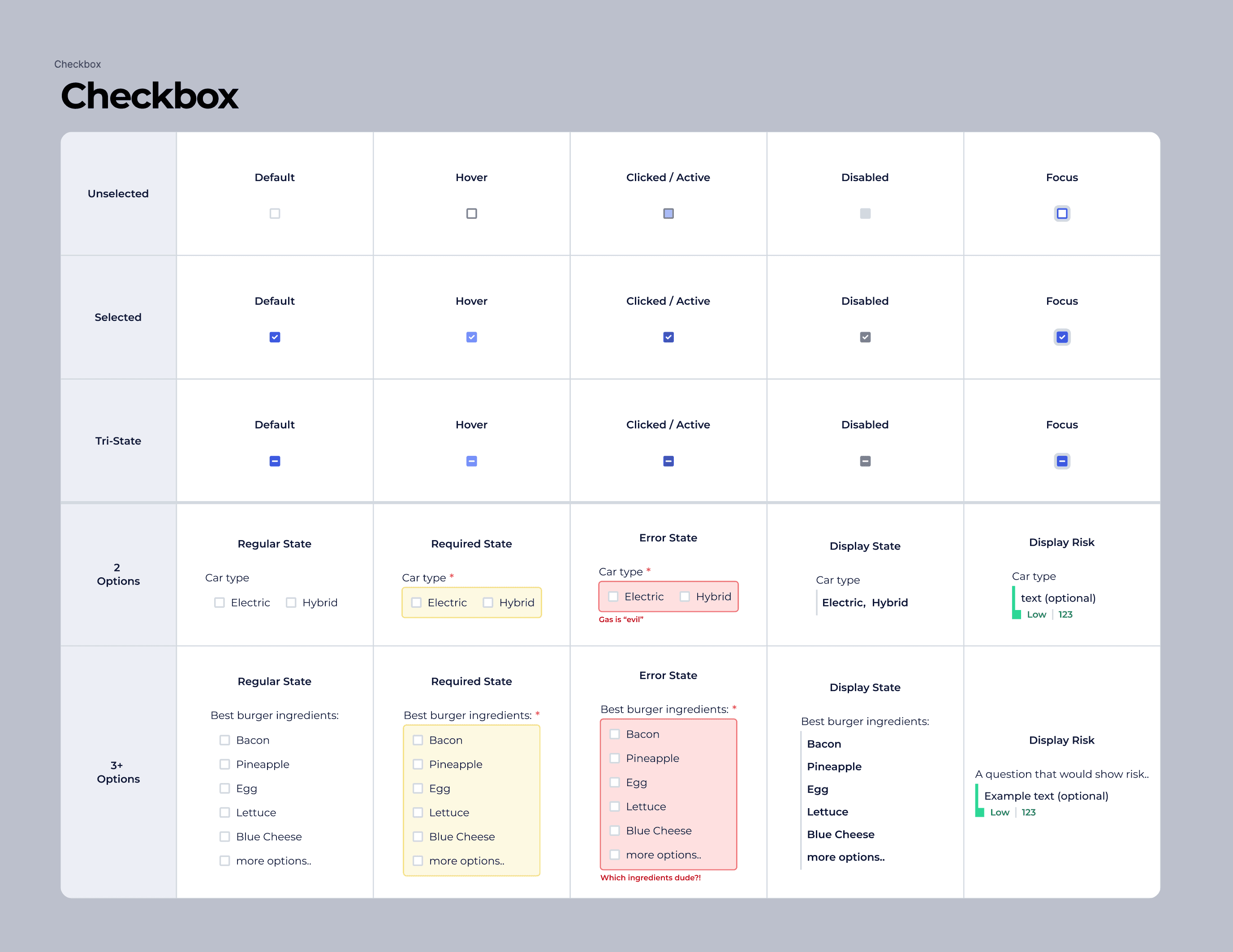
I would create these to show to our developers the wide variety that checkboxes would come in and how they could be used.
—-
This is me prototyping out an app update using all the components from our design system (This video is unlisted so you won’t find it on YouTube)

Tool Tip and Menu GIF
What I learned building this design system
Graphite in a nutshell is a really powerful form builder which meant all the components we had to think through had to have lots of variants.
The text input component was by far the most complex component to build. There are tons of states, versions, permissions, requirements.. it’s a lot to think through.
What did I do there?
I was hired because of my experience building design systems so that’s where I started.
I also:
Created assets to improve employee onboarding (with little to no resources for me to understand procurement, I wanted to learn everything and create new assets so other employees could absorb domain knowledge faster). I created:
User Personas (different user types with different primary goals and motivations)
User Journey Map (a flow that a specific user persona goes through when interacting with Graphite)
Created marketing assets as needed
Coordinated with developers to move existing projects forward
Used the design system on other projects so I could continually refine it. “Ate my own dog food” so I could improve it.
Tools on the job:
Figma for all the component pieces
Figma for animation
Apple QuickTime for screen recording
A website called ezgif.com for turning those videos into bite size gifs
Slack for Team communication and alignment
Design System Breakdown:
I met with the development team and learned that they were importing the majority of their component pieces from a Vue Bootstrap library.
I set out to mimic that library so the design system would look very similar to that (which means a lot less css customization for the developers)
I built the following: (parenthesis is the number of variants) (471 variants)
Accordions (4)
Avatars, People (48: 12 color options and 4 size variants)
Avatars, Company (48: 12 color options and 4 variant sizes)
Alerts (10: 5 Colors and 2 sizes)
Badges: (48+)
Deletable Badges
Number Badges
Status Badges
Banners (10)
Buttons: (96+)
Large Buttons
Small Buttons
Icon Buttons
Cards (4)
Checkboxes (25)
Color Palette (lots of variants—each color could be considered one.. so I’m just going to say 1)
Combo-Boxes (9)
Drag and Drops (18)
Dropdown (6)
Dropdown Item (6)
Empty States (1)
Inputs (32)
Links (4)
Menu Piece (4)
Menu Component (4)
Modals (2)
Navigation, Top (8)
Navigation, Item (8)
Navigation, Side (8)
Pagination (4)
Progress (5)
Radios (30)
Segmented Controls (4)
Table (12)
Table Cell
Table Header Cell
Toasts (10)
Tooltip (1)
Typography Styles (lots of variants—I’ll just say 1)
I would create these to show to our developers the wide variety that checkboxes would come in and how they could be used.
—-
This is me prototyping out an app update using all the components from our design system (This video is unlisted so you won’t find it on YouTube)
Tool Tip and Menu GIF
What I learned building this design system
Graphite in a nutshell is a really powerful form builder which meant all the components we had to think through had to have lots of variants.
The text input component was by far the most complex component to build. There are tons of states, versions, permissions, requirements.. it’s a lot to think through.